Use Cases
QR Codes for Churches & Places of Worship
Congregations carry less cash every year, which has made giving the obvious first use of a QR code in a church — but it's rarely the one that works best first. The codes that get used are the ones attached to something a congregant already wanted: the bulletin they'd have picked up anyway, the signup sheet by the door, the sermon they wanted to hear again. Giving works better once scanning is already a habit.
The short version
- Giving codes should open the giving form, with amounts preset — not the church website.
- Announce it from the front once, slowly. A code nobody is told about gets ignored.
- Leave on-screen codes up for at least 30 seconds — longer than feels comfortable.
- Print it in the bulletin too. Not everyone will scan a screen from row 20.
- Always keep a non-digital route. A code that replaces the offering plate excludes people.
- Use dynamic codes so the same printed bulletin template serves every week.
Start with something other than giving
A giving code introduced cold asks a congregation to learn a new behaviour and hand over money in the same moment. Codes attached to things people already want do the teaching for free.
- This week's bulletin or order of service — the most-scanned code in most churches, because everyone wants it and it saves printing.
- Event and rota signups — replaces the clipboard by the door, and you get legible names.
- Sermon audio or video — for people who missed it or want to share it.
- Prayer requests — a code on the prayer board reaches people who would never approach a person.
- Newcomer welcome — a card in the pew linking to a "new here?" page; far less intimidating than a welcome desk.
- Small group or course signup — where the alternative is remembering to email someone on Monday.
Once scanning is normal, the giving code stops being a novelty and becomes just another option.
Giving codes
The mechanics are the same as any donation QR code, and so is the biggest mistake — linking to the church homepage instead of the giving form.
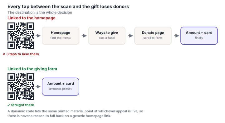
Church-specific considerations on top of the general advice:
- Offer fund designation, but keep it to one tap. General fund, building fund, missions — a short set of buttons, with general preselected. A dropdown of fifteen funds is a place to stall.
- Make recurring giving prominent. Regular giving is the backbone of church finance, and the moment after someone scans is the best time to ask.
- Don't let it feel like a transaction. A giving page that reads like a checkout sits badly in a worship context. Plain, warm, and quick works better than an optimised commerce flow.
- Gift Aid or tax-receipt details go after payment. Never before.
Codes shown during the offering get scanned; codes shown at the end of the service get seen and forgotten. If your tradition has an offering moment, that's when the slide goes up — and it stays up for the whole of it, not for ten seconds.
Placement in the building
| Where | For | Size |
|---|---|---|
| Projection screen | Giving, this week's notices | A third of the slide |
| Bulletin / order of service | Giving, signups, sermon audio | 3–4 cm |
| Pew card or seat back | Newcomer welcome, prayer requests | 3–4 cm |
| Noticeboard in the foyer | Events, rotas, small groups | 8–12 cm |
| Welcome desk card | Newcomers, mailing list | 4–5 cm |
| Outside noticeboard | Service times, events | 15–20 cm |
Two things specific to church buildings are worth planning around. Lighting is often dim during services, particularly in older buildings, which argues for larger codes and high contrast — plain black on white, not a subtle tint. And mobile signal inside stone buildings is frequently poor: if you expect people to scan during a service, guest Wi-Fi matters, and a Wi-Fi QR code on the pew card solves that in one scan.
Making it work for the whole congregation
The most common failure isn't technical. It's introducing a code to a room where a good share of people have never deliberately scanned one, and assuming silence means it worked.
- Demonstrate it from the front, once. Thirty seconds: hold up a phone, open the camera, point, tap. Most people who don't scan simply don't know their camera already does it.
- Say what happens next. "It'll open our giving page — you'll see the amounts there" removes the fear of what a scan might do.
- Never make it the only route. Keep the plate, keep the paper forms, keep the standing-order details in the bulletin. A code should add a lane, not close one.
- Print a short URL alongside for people who'd rather type — and for anyone on an older phone.
- Ask someone in their seventies to try it before it goes live. They'll find the problem in under a minute.
Codes for children's or youth activities need the same care as any other data collection about minors — sign-up forms should sit on a platform your safeguarding policy already covers, and a code on a public noticeboard should never lead to anything showing children's names, photos or attendance. Point public codes at general information, and keep anything person-specific behind a login.
The reusable bulletin code
Most churches print a bulletin to the same template every week. A dynamic code in that template can be repointed each week to the current notices — one code, printed once in the design, pointing at whatever is live.
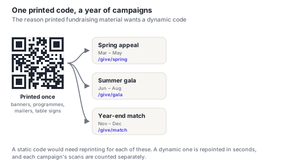
It also answers a question most churches can't otherwise answer: whether anyone reads the bulletin. Scan counts per week are a blunt but honest signal, and they tend to settle arguments about print runs.
Frequently asked questions
How do churches use QR codes?
The most common uses are giving, the weekly bulletin or order of service, event and rota signups, sermon audio, prayer requests and newcomer welcome cards. Giving gets the most attention, but bulletins and signups usually see more scans — they're attached to something people already wanted. Introducing those first makes scanning familiar, which makes the giving code work better when it appears.
How do I set up a QR code for church giving?
Point it at your giving form directly — the page where choosing an amount is the first thing visible — rather than the church homepage. Use a dynamic code so it can be repointed if you change giving platforms. Offer a few preset amounts with the general fund preselected, make recurring giving a visible option, and keep tax or Gift Aid details until after payment. Then complete a real gift yourself on a phone before printing.
How long should a QR code stay on the screen during a service?
At least 30 seconds, which will feel too long from the front and is about right from row 20. People need time to notice it, get a phone out, unlock it, open the camera and aim — and in a church that's often happening while holding a service sheet. If your tradition has an offering moment, leave the code up for the whole of it rather than flashing it at the end.
What if members of our congregation can't use QR codes?
Keep every existing route open — the offering plate, paper forms, standing order details in the bulletin. A QR code should add a lane, not close one. It also helps to demonstrate it from the front once: most people who don't scan simply don't know their phone camera already does it, and a thirty-second walkthrough converts more of them than any amount of signage. Printing a short URL alongside the code covers the rest.
Can we use one QR code for everything?
You can, by pointing it at a simple links page, and for a small church that's often the right answer — one code to explain, one to maintain. The trade-off is an extra tap for every purpose and no ability to tell which one people wanted. If giving matters most, give it its own code so the giving form opens directly, and let a general code handle everything else.