Design & Best Practices
Adding a Logo to a QR Code
Putting a logo in the middle of a QR code works, and it's the single most requested piece of QR branding. It works because error correction treats the covered modules as damage and reconstructs them. The catch is that the budget for that is considerably smaller than almost every guide on the internet claims — including, until we actually measured it, the advice on this site.
The short version
- Keep the logo at or below ~15% of the code's area — not the 20–30% commonly quoted.
- That's roughly 38% of the code's width, since area scales with the square.
- Always use error correction level H. Nothing lower leaves usable margin.
- Never overlap a corner finder pattern — that breaks the code at any logo size.
- Add a blank padding ring around the logo so the scanner gets a clean boundary.
- A logo spends reliability you may need elsewhere. Shorten the payload to buy some back.
Why a logo works at all
Every QR code carries redundant Reed-Solomon data — at level H, enough to reconstruct roughly 30% of the symbol. A centred logo covers modules the scanner then can't read, and that redundancy fills them back in. Nothing special is happening: to the decoder, your logo is indistinguishable from a coffee stain.
That framing is the useful one, because it tells you where the limits come from. The correction budget is finite, it's shared with whatever real-world damage the code also picks up, and it can only repair data. Structural elements aren't covered by it at all.
The real coverage limit
The standard advice is that a logo can cover 20–30% of a code's area at level H. We tested it, because it's the kind of claim that gets repeated without anyone checking: we generated codes at several versions, overlaid centred blocks at increasing coverage levels, and decoded each one with a real barcode detector.
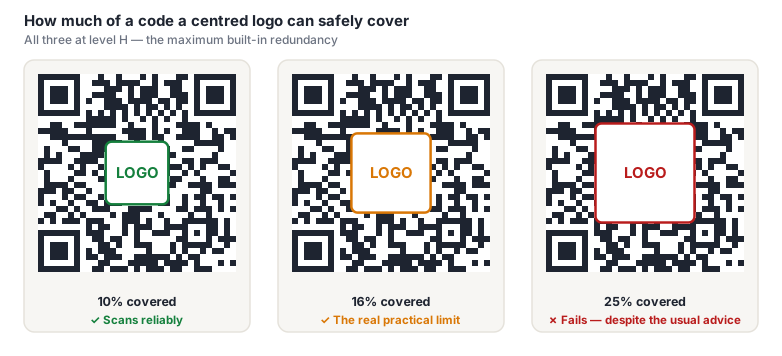
The cliff sat between 16% and 20% of the code's area, consistently, across every version we tried. A 20% logo — the bottom of the range most guides recommend — already failed.
And these were generous conditions: a clean digital render, a perfect quiet zone, no print loss, no camera noise, no awkward angle, no damage. Every one of those factors eats the same budget your logo is spending. Plan for 15% and you have margin. Plan for 25% and you're shipping a code that fails somewhere you won't see it.
"Level H recovers ~30%" is a statement about the proportion of codewords the scheme can repair across the whole symbol, and it assumes errors are spread around. A solid block in the middle of the code isn't spread around — it wipes out entire codeword blocks in one place, and once a block loses more symbols than its own share of correction can fix, that block is gone regardless of how healthy the rest of the code is. The 30% figure is real; reading it as "30% of the picture can be covered by a square" is the error.
Coverage in numbers
| Logo width (% of code) | Area covered | Verdict at level H |
|---|---|---|
| 25% | 6% | Very safe — comfortable margin for print |
| 32% | 10% | Safe — the sensible default |
| 38% | 15% | Maximum recommended |
| 40% | 16% | At the measured edge — no margin left |
| 45% | 20% | Fails in testing |
| 50% | 25% | Fails |
The width column is the one to design against, since that's what you actually set in a layout. Note how fast area grows: going from 38% to 50% width feels like a small nudge and nearly doubles the damage.
Placement matters more than size
A logo well inside the size budget can still destroy a code completely if it's in the wrong place.
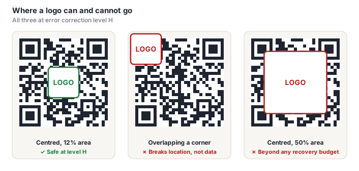
That middle case fails because it sits on a finder pattern, one of the three nested squares in the corners. A scanner uses those to locate the code and work out its orientation before it decodes anything, which means before error correction is available. Damage there isn't a cost against the budget; it's a failure to start.
The same applies, less severely, to the timing patterns — the alternating dark/light lines running between the finders — which the scanner uses to establish module width. Keep clear of those too. In practice, "centred, and no bigger than 38% of the width" keeps you away from all of it. See how QR codes work for what each region does.
Getting the details right
- Set error correction to H before generating, not after. Changing the level changes the grid, so a logo positioned against an L-level code won't sit the same way on the H-level version of the same content.
- Add a blank padding ring. Don't let the logo's edges blend into surrounding modules — a few modules of clear space around it gives the scanner an unambiguous boundary instead of half-covered modules it has to guess at. A white rounded rectangle behind a transparent logo does this for free.
- Keep the logo simple and high-contrast. The area is small and it will be printed small. Wordmarks with fine lettering turn to mush; a monogram or icon survives.
- Prefer a solid backing to a transparent logo. A transparent logo over modules creates ambiguous partial-coverage areas, which decode worse than a cleanly opaque block.
- Shorten the payload. A logo and a long URL compete for the same reliability. Using a dynamic code keeps the grid sparse so the logo costs proportionally less.
- Size up in print. A logo'd code needs more physical size than a plain one, because the modules that remain have to be resolved perfectly — there's no correction budget spare to cover a blurry scan.
A code at the edge of its budget scans on the phone in your hand and fails on a customer's older device, in worse light, at a worse angle. It'll look like it works, right up until it's printed on 10,000 units. If a code scans inconsistently across devices, that isn't a partial success — it's a failure that happens to be passing on your hardware.
Doing it on 1337co.de
The generator supports centre logos directly: upload an image, and it's composited into the middle of the code with a padding ring. Set error correction to H first. Step-by-step instructions are in the help section.
Once you've generated it, run through the pre-print checklist — a logo'd code is exactly the case where testing across several devices matters, since it's the one design decision that deliberately spends your safety margin.
Frequently asked questions
How big can a logo be on a QR code?
At or below about 15% of the code's area, which is roughly 38% of its width, using error correction level H. That's stricter than the 20–30% commonly quoted — we tested a sweep of coverage levels against a real barcode detector and codes began failing between 16% and 20%, under conditions kinder than any print job. Because area scales with the square of width, small width increases cost far more coverage than they appear to.
Does adding a logo break a QR code?
Not if it's sized and placed correctly. Error correction is designed to reconstruct unreadable modules, and a centred logo is just deliberate damage. It breaks the code when it's too large (past ~15% of the area), when it overlaps one of the three corner finder patterns at any size, or when the code is generated at a correction level below H.
Which error correction level do I need for a logo?
H, always. It's the maximum and it's the only level that leaves usable margin once a logo has taken its share. A code with a logo at level M may scan on your desk and fail on a real print run, because the remaining budget has to absorb print loss, lighting and camera quality on top of the logo. See our error correction guide for what each level costs in size.
Can I put a logo in the corner instead of the centre?
No — the corners are the worst possible location. The three nested squares there are finder patterns, which a scanner uses to locate and orient the code before decoding anything. Covering one prevents the code being recognised at all, and error correction can't help because the failure happens before it's reached. Centre placement is standard precisely because it's the region furthest from every structural element.
Why does my logo QR code scan sometimes but not always?
It's sitting at the edge of its recovery budget. Scanning is not binary — a marginal code succeeds when conditions are good (bright light, steady hand, recent phone, square angle) and fails when any of those degrade. Intermittent scanning always means the margin is too thin. Shrink the logo, confirm the level is H, or make the code physically larger.