Design & Best Practices
QR Code Colours: What Scans and What Breaks
Colouring a QR code is the most common branding request and the most common way to break one. The reason is that a scanner never sees your colours — it converts the image to brightness and looks for a threshold. Two colours that are obviously different to you can be nearly identical in brightness, at which point the code effectively doesn't exist as far as a camera is concerned.
The short version
- Scanners work from brightness, not hue. Colour difference is irrelevant; brightness difference is everything.
- Target a contrast ratio of 7:1 or better. Black on white gives 21:1.
- Dark brand colours on white are fine. Mid-tones and pastels are not.
- Contrast ratio alone is not sufficient — it's polarity-blind, so it passes inverted codes that scan badly.
- Gradients are workable if the whole range stays dark; they fail when one end drifts light.
- Never colour the background darker than the modules unless you've tested widely.
What a scanner actually sees
The decode pipeline converts the camera image to greyscale, then binarises it — every pixel becomes dark or light relative to a computed threshold. Hue is discarded before the code is ever read. So the only question that matters for colour is: after everything is converted to brightness, is there still a clear gap between the modules and the background?
The formal way to measure that gap is the WCAG contrast ratio, the same metric used for accessible text. It runs from 1:1 (identical brightness) to 21:1 (black on white).
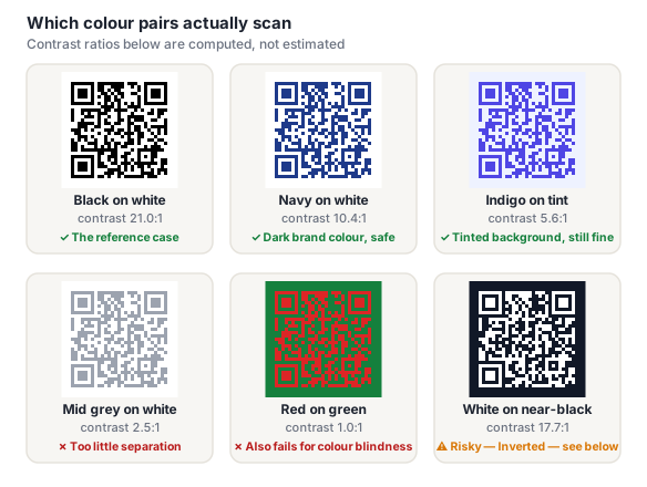
That red-on-green pair is the whole lesson in one image. Nothing about it looks low-contrast. It is completely unreadable to a scanner, and it would also be unreadable to a red-green colourblind viewer, which is roughly 8% of men.
Contrast targets that actually hold up
| Contrast ratio | Verdict | When it's appropriate |
|---|---|---|
| 21:1 | Ideal | Black on white. Use it whenever branding permits. |
| 10:1 – 20:1 | Safe | Dark brand colours on white — navy, forest, burgundy, charcoal. |
| 7:1 – 10:1 | Acceptable | Fine for screens and good print. Test if the stock is textured or the code is small. |
| 4.5:1 – 7:1 | Risky | May scan on a good camera in good light. Will fail somewhere. |
| Below 4.5:1 | Broken | Don't ship it. |
These are stricter than text-accessibility thresholds, deliberately. Text is read by a human brain that's good at compensating; a QR code is read by a threshold algorithm that isn't. And a printed code has to survive ink absorption, lighting, camera quality and viewing angle — every one of which eats margin.
The QR generator computes the contrast ratio between your chosen dot and background colours live and warns you when the pair drops into risky territory, so you don't have to calculate it by hand. Read on for the one thing that check can't catch.
The problem contrast ratio can't see
Contrast ratio is polarity-blind. It's a ratio between two luminances, so it gives an identical answer for black-on-white and white-on-black. Both are 21:1. Only one of them reliably scans.
Most scanner implementations are tuned to expect dark modules on a light background, because that's what the specification's reference decoding procedure describes and what virtually all codes look like. Many handle inverted codes anyway; some don't attempt them at all; a few try and fail intermittently depending on lighting. You cannot predict which of those your customer is holding.
Our contrast checker will pass an inverted pair with an excellent score, because by definition contrast ratio can't distinguish polarity. That's a real limitation and worth stating plainly rather than hiding: a green score on a light-on-dark code means "the brightness gap is fine," not "this will scan everywhere." If you use one of our dark-background colour templates, test on several real devices — different manufacturers, at least one older phone — before committing to a print run.
If you want a dark aesthetic without the risk, the usual answer is to keep the code itself conventional and put the darkness around it: dark page, light plate behind the code, dark modules on the plate. You get the visual effect and a code that behaves normally.
Using a brand palette without breaking things
- Pick the darkest colour in your palette for the modules. Most brand systems have a deep neutral or a dark primary — that's your module colour. Accent colours are usually mid-tone and belong nowhere near a QR code.
- Leave the background white or near-white. A very pale tint of a brand colour is fine and often reads as more "designed" than pure white while costing almost no contrast.
- Don't colour the finder patterns differently from the data. It's a popular styling move and it's a real risk — those corners are what the scanner locates first, and giving them a lighter accent colour is the single worst place to spend contrast.
- Treat gradients as a range, not a colour. A gradient is only as good as its lightest point, because that's where the threshold gap is narrowest. A dark-navy-to-mid-blue gradient fails at the blue end even though it looks rich overall.
- Never place a coloured code over coloured artwork. Two variables at once, and the background one moves.
The generator's colour templates are all pre-checked pairs, which is the fastest way to get a branded code that behaves. See the help page on colours and templates for how to apply them.
Printing considerations that change the answer
A colour pair that passes on screen can still fail on paper, because print introduces losses your monitor doesn't:
- Ink spread. Dark ink bleeds slightly into surrounding light areas, narrowing the effective gap — worse on uncoated and absorbent stock.
- CMYK conversion. A vivid RGB colour often converts to a duller, lighter CMYK equivalent. Check the contrast ratio of the converted colour, not the one on your screen.
- Rich black vs. flat black. Single-channel black on some presses reproduces as dark grey. If a code must be black, specify it deliberately.
- Coloured stock. Printing on anything but white shifts your background colour whether you intended it or not — the paper is now part of the pair.
When in doubt on print, fall back to black on white. It costs you a branding opportunity and buys you the widest possible margin. Our guide to testing before printing covers how to verify this on a real proof.
Frequently asked questions
Can QR codes be in colour?
Yes. Colour has no effect on the encoded data — the grid is identical regardless. What matters is brightness: the modules need to be clearly darker than the background, ideally by a contrast ratio of 7:1 or more. Dark brand colours on a white or very pale background work well. Mid-tones, pastels, and any pairing where the two colours have similar brightness will fail even if they look completely different to you.
Can a QR code be white on a black background?
It's valid per the specification and has excellent contrast, but it scans less reliably than the conventional dark-on-light arrangement, because most scanner software is tuned to expect dark modules on a light background. Some readers handle inverted codes perfectly, some won't attempt them at all, and you can't control which one a customer has. If you want the dark look, a safer route is a dark layout with a light plate behind a conventional code.
Why does my coloured QR code scan on screen but not in print?
Print loses contrast that a screen doesn't. RGB colours convert to duller CMYK equivalents, ink spreads into surrounding light areas, and uncoated stock absorbs more than coated. A pair sitting at 6:1 on your monitor can land near 4:1 on paper — over the edge. Check the contrast of the CMYK-converted colour rather than the on-screen one, and get a physical proof on the real stock.
Can I use a gradient in a QR code?
Yes, provided the entire gradient stays dark. A gradient is only as reliable as its lightest point, since that's where the brightness gap against the background is smallest. Dark navy to deep purple is fine; dark navy to mid-blue is not, because the light end drops below the threshold even though the overall effect looks rich. Check the contrast ratio of the lightest stop, not the average.
Can I colour the corner squares differently?
You can, and it's a common styling choice, but it's the riskiest place to spend contrast. The three corner finder patterns are what a scanner uses to locate and orient the code before it reads any data, so a light or low-contrast accent colour there can prevent the code being recognised at all — a failure that happens before error correction is available to help. If you style the corners, keep them at least as dark as the data modules.